A Trusted Residential & Commercial Renovation Company in Singapore. Cost Efficiency a Promise!
Choosing the perfect colour theme for your retail shop
Choosing the right colour theme for your retail shop is a crucial decision that can significantly impact customer experience, brand perception, and ultimately, sales. Colours influence emotions, behaviors, and decision-making processes, making them an essential part of retail store design. This guide provides comprehensive tips on selecting the ideal color scheme for your store, considering aspects such as brand identity, target audience, psychology of colors, and practical design principles.
Esther Ong
2/16/20256 min read
Choosing the right color theme for a retail shop is one of the most important decisions a store owner or designer can make. A well-thought-out color scheme can significantly influence the shopping experience, customer behavior, and overall ambiance of the store. The color theme is not just about aesthetic appeal but also about creating an emotional connection with customers, conveying the brand’s message, and setting the mood of the space. In this passage, we will explore various tips and strategies for selecting a color theme that can enhance your retail shop’s appeal and increase its chances of success.
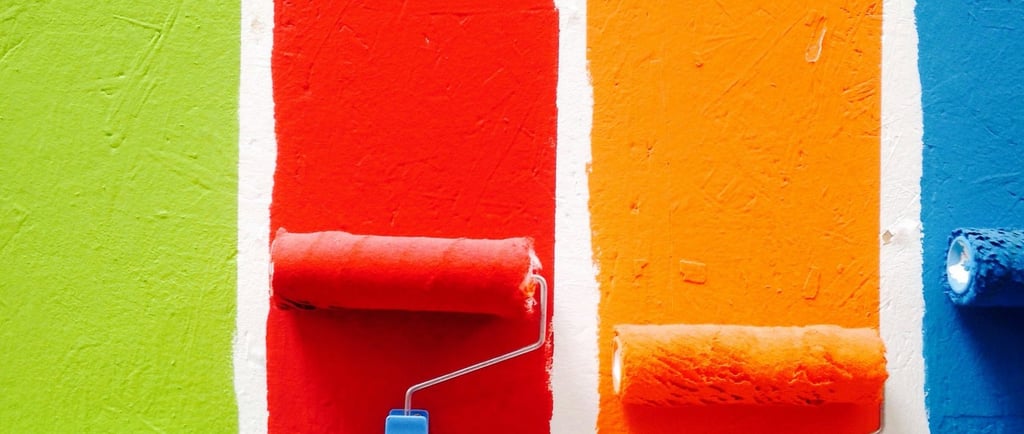
1. Understand the Psychology of Color
Before diving into choosing a color palette for your retail shop, it’s crucial to understand the psychology of color. Colors can evoke strong emotions and perceptions, which can directly impact consumer behavior. Different colors can have various meanings and effects on people’s mood, decisions, and actions.
For instance:
Red: Often associated with passion, excitement, and energy, red is an attention-grabbing color. It can encourage impulse purchases and stimulate appetite, making it a popular choice in restaurants and food-related businesses.
Blue: Known for its calming and trustworthy qualities, blue conveys professionalism, stability, and reliability. It is often used by brands that want to appear authoritative, secure, and dependable, such as banks or tech stores.
Yellow: A bright, happy, and optimistic color, yellow can evoke feelings of warmth and positivity. It can stimulate mental activity and creativity, though it should be used sparingly, as it can be overwhelming in large amounts.
Green: Green is commonly associated with nature, health, and wellness. It is a color that communicates relaxation, freshness, and environmental consciousness, making it ideal for eco-friendly brands or stores selling organic products.
Black: Sophisticated, elegant, and luxurious, black is often used in high-end retail shops. It can convey authority and exclusivity, and when paired with other colors, it can provide a sleek, modern feel.
White: White is clean, fresh, and minimalistic. It creates a sense of openness and purity. It is often used in stores that want to communicate simplicity and elegance, such as high-end boutiques or minimalist design shops.
Orange: A warm, energetic color that combines the excitement of red with the happiness of yellow, orange is great for drawing attention and creating a fun, lively atmosphere. It works well in stores that want to project a playful or creative vibe.
Understanding how each color can affect consumer emotions is a key step in choosing the right palette for your retail store. Different industries and store types will have specific color themes that align better with their target market’s preferences.
2. Consider Your Brand Identity
The color theme of your retail store should be closely aligned with your brand identity. Your brand’s core values, personality, and the products you sell will help guide your color choices.
For example, if your store is selling luxury fashion items, you might want to choose a more elegant and timeless color palette, using darker tones like deep blue, black, or gold to communicate sophistication. On the other hand, if you are running a toy store or a children’s boutique, a vibrant and playful color palette using primary colors like red, blue, and yellow may be more fitting to evoke fun and energy.
A good practice is to start by identifying the message you want to communicate with your store design. Are you aiming for a modern, minimalist vibe, or a cozy, welcoming atmosphere? What do your competitors look like, and how can your store stand out while staying true to your brand identity?
3. Take Inspiration from Your Products
Another important factor to consider when choosing a color theme is your product offerings. The colors of your merchandise should work harmoniously with the store’s overall aesthetic. Think about the colors of your products and how they will be presented within the space. For example, if your store specializes in natural, handmade goods, earthy tones like brown, green, and beige may be appropriate to reflect the products' organic qualities.
On the other hand, if you sell high-tech gadgets or modern fashion items, a sleek, minimalist color palette of black, white, and metallic accents could help complement the futuristic feel of your products. The key is to ensure that the colors of your store enhance and support your products, rather than distract from them.
4. Think About the Target Demographic
Your target demographic will significantly influence the colors you choose for your store. Age, gender, cultural background, and even personality types can all play a role in how colors are perceived. It’s essential to consider who your ideal customers are and choose colors that resonate with them.
Young Adults: Bright, bold, and trendy colors may appeal to younger audiences. Vibrant colors like neon pink, electric blue, and lime green can evoke a youthful and energetic atmosphere.
Middle-Aged Customers: For a more mature audience, subdued tones like navy blue, gray, or muted pastels may work best. These colors tend to convey a sense of sophistication and stability.
Luxury Shoppers: For high-end retail, sophisticated neutrals such as black, gold, or silver are commonly used to evoke feelings of exclusivity, luxury, and high status.
It’s also important to keep in mind cultural differences when choosing a color palette. For example, while red is considered a symbol of luck and prosperity in Chinese culture, it may not have the same positive associations in other parts of the world.
5. Create a Harmonious Color Scheme
While experimenting with colors, it’s important to ensure that the chosen palette is cohesive. A disjointed color scheme can make the store look chaotic and unprofessional. To create a harmonious design, use color theory principles such as the following:
Monochromatic Scheme: This approach uses varying shades, tints, and tones of a single color. It creates a clean and organized look, perfect for minimalist designs.
Analogous Scheme: This color scheme uses colors that are next to each other on the color wheel, such as blue, blue-green, and green. It’s a soothing, harmonious choice that works well for stores looking to create a calm and relaxing atmosphere.
Complementary Scheme: This color scheme uses opposite colors on the color wheel, such as blue and orange or red and green. When used effectively, complementary colors create a dynamic, energetic effect. However, balance is key, as too much contrast can become overwhelming.
Triadic Scheme: Involves using three equally spaced colors on the color wheel, such as red, blue, and yellow. This approach can create a balanced yet vibrant color palette, making it great for stores looking to create a lively and engaging atmosphere.
Keep in mind that the colors of your walls, fixtures, furniture, and signage should work well together to create a unified experience. You don’t want to overwhelm your customers with too many competing colors, so it’s best to limit the palette to a few main colors and a few accent shades.
6. Consider Lighting and Store Layout
Lighting plays a crucial role in how colors are perceived in a retail store. Different light sources can make colors appear warmer or cooler, brighter or duller. Be sure to test your color scheme under different lighting conditions to ensure that the colors you’ve chosen will look appealing in the store.
Natural light can make colors appear more vibrant, while artificial lighting may have a different effect. If your store has large windows, you may need to adjust the color choices depending on how the sunlight interacts with the space. Additionally, the layout of the store can impact how colors are perceived. For example, accent walls or feature displays may benefit from bold colors, while the rest of the space could have more neutral tones to allow the merchandise to take center stage.
7. Keep It Simple and Flexible
While experimenting with bold color schemes can be fun, it's often wise to keep the overall palette relatively simple. Too many colors can overwhelm customers and detract from the shopping experience. A simple color scheme allows customers to focus on the products themselves rather than being distracted by overly bright or clashing colors.
Additionally, consider how your color choices will evolve over time. Fashion and design trends change, and your store’s look should be adaptable without requiring a complete overhaul. Having a flexible color scheme that can be easily updated or adjusted will save you time and money in the future.
8. Consider the Local Environment
Finally, it’s essential to consider the surrounding environment when selecting a color theme. The exterior and location of your retail store may influence the colors you choose. For example, if your store is located in a vibrant, trendy urban area, you may want to go for bold and striking colors that stand out against the city’s backdrop. Alternatively, if your store is located in a more rural or suburban area, you may want to choose a more subdued or natural color palette that fits in with the local environment.
Take time to observe other businesses in the area and determine how your color theme can differentiate your store while still blending well with its surroundings. Your store’s exterior should also reflect the interior color palette for a cohesive look.
Conclusion
Choosing the right color theme for your retail shop is an essential part of creating a welcoming and engaging environment for customers. From understanding color psychology and aligning with your brand identity to considering the target demographic, lighting, and store layout, there are many factors to consider. A well-chosen color palette can attract customers, influence their behavior, and leave a lasting impression. By following these tips and taking the time to carefully select a color scheme that suits your brand and products, you can create a space that invites shoppers to explore, engage, and ultimately, make a purchase.
Colors Matter
Learn How do Colors Affect Purchases
